

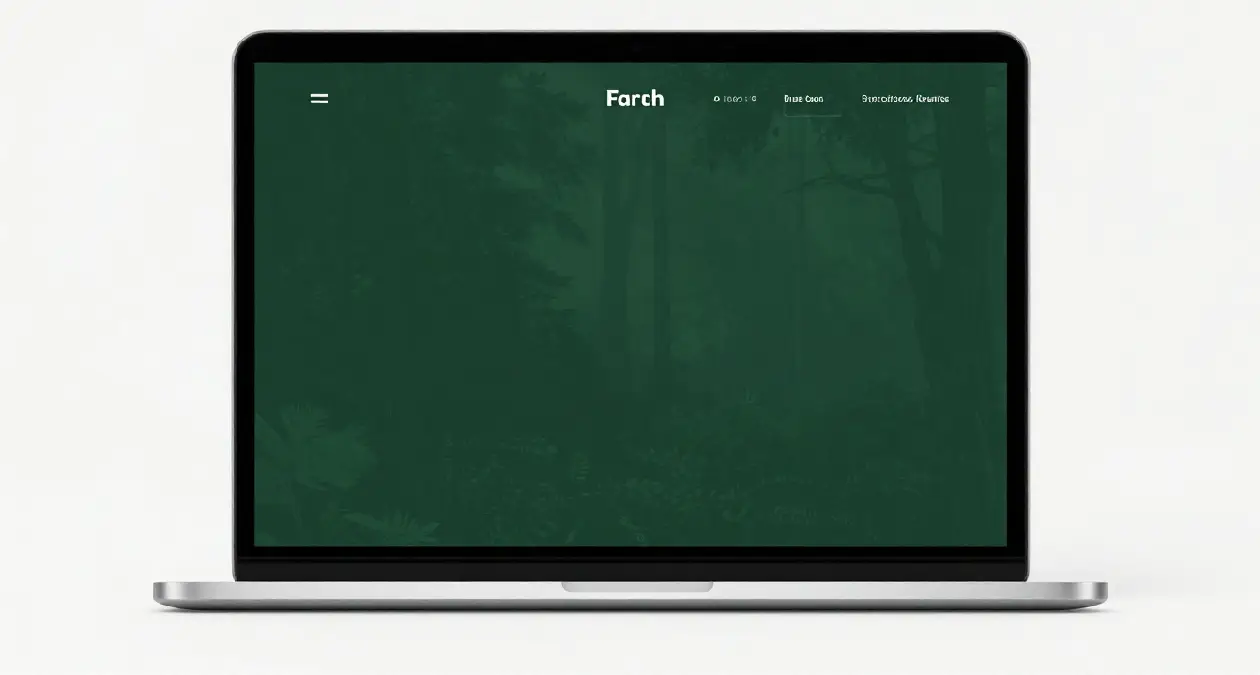
Quick answer: You do not need a special “dark green theme” to get a dark green website. Pick any well-built WordPress theme that supports the block editor’s colour settings, set a deep green as the background, and keep text at a contrast ratio of at least 4.5:1. The palette below passes that test.
Last reviewed October 21, 2026.
I removed the old version of this post because it described five themes by name that I could not point you to a download page for. This version is something you can actually use: a tested colour palette, the exact steps to apply it, and the mistakes that make dark green sites hard to read.
A dark green palette that is readable
I calculated the contrast ratios below with the WCAG formula against a background of #14342B. WCAG asks for at least 4.5:1 for normal body text and 3:1 for large text, as explained in the W3C contrast guidance.
| Use | Colour | Contrast on dark green |
|---|---|---|
| Page background | #14342B | – |
| Body text | #F4EFE3 (warm cream) | 11.8:1 |
| Headings | #FFFFFF | 13.5:1 |
| Links and buttons | #C9A24B (muted gold) | 5.6:1 |
| Secondary accents | #7FB69E (soft sage) | 5.8:1 |
| Avoid for text | #4F7F6A (mid green) | 2.9:1, fails |
The last row is the common trap. A mid green looks fine as a decoration, but as text on a dark green background it is too faint for many readers.
How to apply it in WordPress
If you use a block theme (Twenty Twenty-Four and newer, for example), open Appearance → Editor → Styles → Colors and set the background, text, link and button colours. The WordPress Styles documentation covers where these settings live. With a classic theme, use Appearance → Customize → Colors if your theme offers it.
If your theme has no colour controls, add a few lines under Appearance → Customize → Additional CSS:
body { background: #14342B; color: #F4EFE3; }
h1, h2, h3, h4 { color: #FFFFFF; }
a { color: #C9A24B; }
a:hover, a:focus { color: #FFFFFF; }
.wp-block-button__link { background: #C9A24B; color: #14342B; }
Check one page on your phone and one on a laptop after saving. Menus, forms and footers often have their own colours and may need an extra rule.
What to look for in a theme
- Colour controls in the editor. You should be able to change background, text and link colours without code.
- Responsive layout. Test it on a real phone, not only in a preview.
- Light footprint. A heavy theme slows the site no matter what colour it is. Check the demo with a speed test before you commit.
- Recent updates. The theme page on WordPress.org shows when it was last updated and which WordPress version it was tested with.
Mistakes to avoid
- Low-contrast text. Dark or mid-tone text on a dark green background disappears. Check every text colour with a tool such as the WebAIM contrast checker.
- Neon accents. Bright green or lime against dark green vibrates and tires the eyes.
- Dark images on dark backgrounds. Photos with dark edges blend into the page. Add a light border or a lighter card behind them.
- Forgetting the editor. If you write posts in the editor, make sure the editor style matches, or you will be guessing how text looks.
Does colour affect SEO?
Not directly. Google does not rank a site higher for being dark green. What matters is that the page is readable, fast and works on mobile, because those affect whether people stay and read. A readable palette helps with that; the colour itself does not.
Where to go next
If you are still deciding where to build your site, read my guide to the best blogging platforms for beginners. If you are setting up a personal site from scratch, what a personal blog is and how to create one walks through the first month.
FAQs
Can I use dark green on any website platform?
Most platforms let you set custom colours. WordPress block themes, Wix and Squarespace all expose background and text colour settings, though the exact menu names differ.
Is a dark background good for long articles?
It can work, but many readers find light text on a dark background harder over long passages. If your site is mostly articles, consider a light page background and use dark green for the header, footer and buttons instead.
What contrast ratio should I aim for?
At least 4.5:1 for normal text and 3:1 for large text, following WCAG.
Will a colour change break my site?
Colour settings and Additional CSS do not touch your content. If something looks wrong, remove the CSS you added and the original look returns.