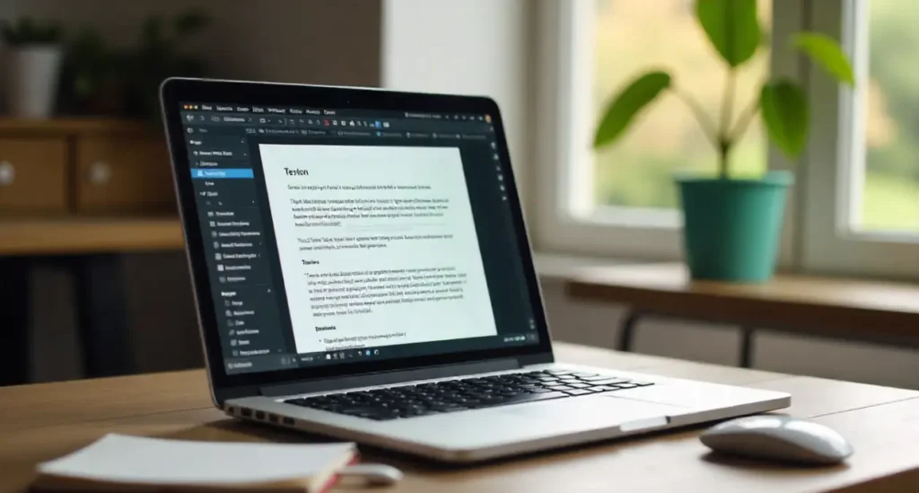
Wrapping text around images makes your posts feel professional, readable, and engaging. If you want to wrap text around image in wordpress block editor, this guide walks you through the fastest, clearest ways — step by step. I’ll keep it simple and practical so you can follow along and finish in minutes.
Why Wrapping Text Around Images Matters
Visual appeal and readability
A well-wrapped image creates rhythm in a page. Instead of a blocky interruption, the image and text flow together. That keeps readers on the page longer. Think of the image like a dancer — the text should orbit it, not trip over it.
SEO and content flow
Search engines reward good user experience. Proper image placement plus optimized alt text helps crawlers understand context. When you wrap text around image in wordpress block editor, you also control how content is read and scanned — helping headings, meta, and user engagement.
Before You Start: Prep Your Image
Optimize size and format
Use JPEG for photos, PNG for images needing transparency, and WebP where supported. Resize images to the max display size you’ll use (no need to upload a 4000px wide photo if your post shows it at 800px).
Add alt text for accessibility
Always add descriptive alt text. It helps screen readers and improves SEO. Example: alt=”Woman holding a tablet showing a WordPress editor with wrapped image example”.
Method 1 — Use the Image Block Alignment
Left, Right, Wide, and Full
The simplest way to wrap text around image in wordpress block editor is to select the Image block and use the alignment controls. Left or Right gives a basic wrap; Wide or Full spans more.
Step-by-step: Align an image
- Insert an Image block.
- Upload/select the image.
- Click the alignment button on the toolbar.
- Choose Align left or Align right.
- Add a paragraph next to the image; text should flow beside it.
Tip: Use image padding (Block settings → Advanced → Additional CSS class) or built-in spacing controls for breathing room.
Method 2 — Use the Media & Text Block (Best for Side-by-Side)
Why Media & Text works
The Media & Text block is made for side-by-side media and text. It keeps content aligned and responsive, making it ideal when you want even columns: image on one side, text on the other.
Step-by-step: Insert Media & Text
- Click the “+” and add Media & Text block.
- Upload or select media on one side.
- Type or paste your text on the opposite side.
- Adjust media width and vertical alignment from the block toolbar.
- Use the block’s stacking toggle to define mobile behavior.
This is not true “wrap” (text hugging the image), but it’s clean and responsive and often the best practical choice.
Method 3 — Use Columns Block for Complex Layouts
When to prefer Columns
If you want multiple images with text wrapping around each, or a magazine-style layout, columns give you full layout control.
Step-by-step: Create columns and wrap text
- Insert a Columns block (choose two or more columns).
- Put an Image block in one column and a Paragraph block in the other.
- Adjust column widths to achieve the desired wrap feel.
- For staggered text, mix multiple Columns blocks as needed.
Columns are great for grid-like designs where the image doesn’t need to be inline with long flowing text.
Method 4 — Add Custom CSS for Advanced Wrapping
Sometimes the block editor alignment isn’t enough. Custom CSS gives you precision when you want the text to hug irregular image shapes, or when you need inline float behavior similar to classic editors.
Adding CSS class to the image block
- Select the image block.
- In the right-hand block settings, open Advanced.
- Add an Additional CSS class like float-left or wrap-image.
- Save and add CSS in your theme customizer (Appearance → Customize → Additional CSS) or child theme.
Sample CSS snippets
/* Float left with text wrap and margin */
.wrap-image {
float: left;
margin: 0 1em 1em 0; /* top right bottom left */
max-width: 40%;
}
/* Float right */
.wrap-image-right {
float: right;
margin: 0 0 1em 1em;
max-width: 40%;
}
/* Clearfix after block for safety */
.clearfix::after {
content: “”;
display: table;
clear: both;
}
Add class=”clearfix” to the container block if surrounding content needs clearing.
Be careful: floating elements can affect layout and responsiveness. Always test on mobile.
Responsive Considerations
How wrapping behaves on mobile
On small screens, floated images usually stack above or below text. That’s fine — the priority is readability. Use CSS media queries to control when floats are disabled.
CSS tricks for responsive wrapping
@media (max-width: 768px) {
.wrap-image, .wrap-image-right {
float: none;
display: block;
margin: 0 auto 1em;
max-width: 90%;
}
}
This ensures images center on mobile and text displays line by line below the image.
Accessibility & SEO Best Practices
Alt text and semantic HTML
Always add clear alt text. If the image is decorative, use an empty alt (alt=””). Descriptive alt attributes improve the chance your image will rank in image search and help screen readers.
Image file names, captions, and structured content
Rename files with meaningful names (e.g., wrap-text-around-image-wordpress-block-editor.jpg). Use captions for context — they are visible to readers and indexed by search engines.
Also, place images near relevant headings and paragraphs. This helps search engines understand context and relevance for the wrap text around image in wordpress block editor keyword.
Performance Tips
Lazy loading and image formats
WordPress has native lazy-loading for images. Use WebP where possible for smaller file sizes and faster load times.
Tools for optimization
- ShortPixel, Imagify, or Smush for bulk optimization.
- Use the built-in WordPress Image Editor to crop and resize.
- Serve scaled images by uploading multiple sizes or relying on responsive srcset.
Faster pages mean better SEO and higher engagement.
Troubleshooting Common Issues
Image not aligning?
- Ensure the image block is selected, then use the toolbar alignment icons.
- If theme CSS overrides alignment, add a custom class and use stronger selectors in your CSS (or use !important sparingly).
Text not wrapping on mobile?
- Check media queries. If your theme stacks blocks on mobile, that’s normal.
- Use float and a media query to control behavior, or rely on the Media & Text block and enable stacking as needed.
Quick Workflow: 6 Simple Steps to Wrap Text Around Image in WordPress Block Editor
- Optimize your image (size, format, and filename).
- Insert an Image block where you want it.
- Use alignment (left or right) or add a Media & Text block for side-by-side.
- Add an alt text and a caption if helpful.
- Add spacing using block settings or a small custom class like wrap-image.
- Preview on desktop and mobile. Adjust widths or CSS as needed.
Follow these steps to easily wrap text around image in wordpress block editor without breaking layout or accessibility.
Conclusion
Wrapping text around images in the WordPress block editor is easier than it looks. Start with the simple Image block alignment or use Media & Text for a reliable side-by-side layout. For finer control, add a custom CSS class and a few responsive rules. Always optimize images and write good alt text to support SEO and accessibility. With these methods you’ll create readable, attractive posts that keep people scrolling — and that’s the real win.
FAQs
Q1: Can I make text wrap around an image with irregular shape in the block editor?
Yes, but it requires custom CSS and possibly an SVG or PNG with transparency plus CSS shape-outside. Most themes don’t support shape-outside by default, so add it in your theme CSS and assign a class to the image.
Q2: Will floating images hurt mobile layout?
Not if you handle it with media queries. Disable floats or change the image display for screens under a set width so text stacks cleanly.
Q3: Is Media & Text block SEO-friendly?
Yes. It produces clean HTML and places image and text logically. Remember to include alt text and captions for best SEO results.
Q4: Do I need a plugin to wrap text around images?
No. For most use-cases, the block editor’s alignment, Media & Text, and Columns blocks are enough. Use a plugin only if you need advanced shapes or complex float behavior.
Q5: How often should I optimize images for SEO?
Always — before upload. Resize, compress, use the right format, and write descriptive alt text. That saves bandwidth and boosts SEO automatically.


